Very Important Note: If you paste this code in all themes, you will find additional settings inside the apps section. Therefore, I recommend that no matter which theme you are using, you should paste this code in the Sections folder under the file name apps.liquid.
Hello, Our Apps Users
We’ve noticed that some users are experiencing issues with Shopify free apps when using the Horizon (new update) theme and a few other Shopify free themes.
However, this issue does not occur with the Shopify Dawn theme, Shopify core premium themes, or ThemeForest themes.
If you are facing this issue on the Horizon theme or any newly updated Shopify free theme, please review the Video we’ve shared and follow the guideline below.
Create file name : apps.liquid and past it
Summary :
– This issue is related to the Horizon / Shopify free theme layout behavior
– It is not an app bug
– Dawn, Shopify premium themes, and ThemeForest themes work without any issues
– Following the steps above will resolve the problem
If you still face issues after following this guide, please share updated screenshots and we will be happy to assist further.
Why This Issue Happens:
In the Horizon new update theme (and some other Shopify free themes), when you add an app block, it is automatically wrapped inside a Section container.
This Section applies automatic CSS and admin UI styles, which may conflict with the app’s layout. As a result, app content such as FlipBooks or iframe-based apps may appear squeezed, misaligned, or broken.
This is a theme-level layout behavior, not an app bug.
How to Fix the Issue (Solution)
Please follow these steps carefully:
1. Go to Online Store → Themes → Edit code
2. Open the Sections folder
3. Find the file named apps.liquid
– If the file exists, open it and paste the provided code into it
– If the file does not exist, create a new file named apps.liquid and paste the code into it
4. Save the file
5. Go back to Theme Customization
6. Add the app block again
After completing these steps, everything should display correctly.
					{%- style -%}
  .apps-section-{{ section.id }} {
    background-color: {{ section.settings.bg_color }};
    {% if section.settings.bg_image != blank %}
      background-image: url({{ section.settings.bg_image | image_url: width: 2400 }});
    {% else %}
      background-image: none;
    {% endif %}
    background-size: {{ section.settings.bg_size }};
    background-position: {{ section.settings.bg_position }};
    background-repeat: {{ section.settings.bg_repeat }};
    background-attachment: {{ section.settings.bg_attachment }};
    margin-top: {{ section.settings.margin_top }}px;
    margin-bottom: {{ section.settings.margin_bottom }}px;
    padding-top: {{ section.settings.padding_top }}px;
    padding-bottom: {{ section.settings.padding_bottom }}px;
    min-height: {{ section.settings.section_height }}px;
    position: relative;
    overflow: hidden;
  }

  .apps-section-{{ section.id }} .apps-section__inner {
    position: relative;
    z-index: 1;
    min-height: inherit;
    display: flex;
    flex-direction: column;
    justify-content: center;
  }

  .apps-section-{{ section.id }} .apps-section__blocks {
    display: flex;
    flex-direction: column;
    width: 100%;
    align-items:
      {% case section.settings.block_alignment %}
        {% when 'left' %} flex-start
        {% when 'center' %} center
        {% when 'right' %} flex-end
      {% endcase %};
  }

  .apps-section-{{ section.id }} .apps-section__block-item {
    width: 100%;
    max-width: 100%;
  }

  .apps-section-{{ section.id }} .apps-section__block-item > * {
    max-width: 100%;
  }

  @media screen and (max-width: 749px) {
    .apps-section-{{ section.id }} {
      margin-top: {{ section.settings.margin_top_mobile }}px;
      margin-bottom: {{ section.settings.margin_bottom_mobile }}px;
      padding-top: {{ section.settings.padding_top_mobile }}px;
      padding-bottom: {{ section.settings.padding_bottom_mobile }}px;
      min-height: {{ section.settings.section_height_mobile }}px;
      background-attachment: scroll;
    }
  }
{%- endstyle -%}

<div class="apps-section-{{ section.id }}">
  <div class="apps-section__inner {% if section.settings.include_margins %}page-width{% endif %}">
    <div class="apps-section__blocks">
      {% for block in section.blocks %}
        <div class="apps-section__block-item" {{ block.shopify_attributes }}>
          {% render block %}
        </div>
      {% endfor %}
    </div>
  </div>
</div>

{% schema %}
{
  "name": "Apps",
  "tag": "section",
  "class": "section",
  "settings": [
    {
      "type": "checkbox",
      "id": "include_margins",
      "default": true,
      "label": "Include page margins"
    },
    {
      "type": "header",
      "content": "Background"
    },
    {
      "type": "color",
      "id": "bg_color",
      "label": "Background color",
      "default": "#ffffff"
    },
    {
      "type": "image_picker",
      "id": "bg_image",
      "label": "Background image"
    },
    {
      "type": "select",
      "id": "bg_size",
      "label": "Background size",
      "default": "cover",
      "options": [
        { "value": "cover", "label": "Cover" },
        { "value": "contain", "label": "Contain" },
        { "value": "auto", "label": "Auto" }
      ]
    },
    {
      "type": "select",
      "id": "bg_position",
      "label": "Background position",
      "default": "center center",
      "options": [
        { "value": "left top", "label": "Left top" },
        { "value": "center top", "label": "Center top" },
        { "value": "right top", "label": "Right top" },
        { "value": "left center", "label": "Left center" },
        { "value": "center center", "label": "Center center" },
        { "value": "right center", "label": "Right center" },
        { "value": "left bottom", "label": "Left bottom" },
        { "value": "center bottom", "label": "Center bottom" },
        { "value": "right bottom", "label": "Right bottom" }
      ]
    },
    {
      "type": "select",
      "id": "bg_repeat",
      "label": "Background repeat",
      "default": "no-repeat",
      "options": [
        { "value": "no-repeat", "label": "No repeat" },
        { "value": "repeat", "label": "Repeat" },
        { "value": "repeat-x", "label": "Repeat horizontally" },
        { "value": "repeat-y", "label": "Repeat vertically" }
      ]
    },
    {
      "type": "select",
      "id": "bg_attachment",
      "label": "Background attachment",
      "default": "scroll",
      "options": [
        { "value": "scroll", "label": "Scroll" },
        { "value": "fixed", "label": "Fixed" }
      ]
    },
    {
      "type": "header",
      "content": "Desktop spacing"
    },
    {
      "type": "range",
      "id": "margin_top",
      "min": 0,
      "max": 300,
      "step": 4,
      "unit": "px",
      "label": "Margin top",
      "default": 0
    },
    {
      "type": "range",
      "id": "margin_bottom",
      "min": 0,
      "max": 300,
      "step": 4,
      "unit": "px",
      "label": "Margin bottom",
      "default": 0
    },
    {
      "type": "range",
      "id": "padding_top",
      "min": 0,
      "max": 300,
      "step": 4,
      "unit": "px",
      "label": "Padding top",
      "default": 0
    },
    {
      "type": "range",
      "id": "padding_bottom",
      "min": 0,
      "max": 300,
      "step": 4,
      "unit": "px",
      "label": "Padding bottom",
      "default": 0
    },
    {
      "type": "range",
      "id": "section_height",
      "min": 0,
      "max": 1200,
      "step": 20,
      "unit": "px",
      "label": "Section minimum height",
      "default": 0
    },
    {
      "type": "header",
      "content": "Mobile spacing"
    },
    {
      "type": "range",
      "id": "margin_top_mobile",
      "min": 0,
      "max": 200,
      "step": 4,
      "unit": "px",
      "label": "Mobile margin top",
      "default": 0
    },
    {
      "type": "range",
      "id": "margin_bottom_mobile",
      "min": 0,
      "max": 200,
      "step": 4,
      "unit": "px",
      "label": "Mobile margin bottom",
      "default": 0
    },
    {
      "type": "range",
      "id": "padding_top_mobile",
      "min": 0,
      "max": 200,
      "step": 4,
      "unit": "px",
      "label": "Mobile padding top",
      "default": 0
    },
    {
      "type": "range",
      "id": "padding_bottom_mobile",
      "min": 0,
      "max": 200,
      "step": 4,
      "unit": "px",
      "label": "Mobile padding bottom",
      "default": 0
    },
    {
      "type": "range",
      "id": "section_height_mobile",
      "min": 0,
      "max": 800,
      "step": 20,
      "unit": "px",
      "label": "Mobile section minimum height",
      "default": 0
    },
    {
      "type": "header",
      "content": "Block alignment"
    },
    {
      "type": "select",
      "id": "block_alignment",
      "label": "Block alignment",
      "default": "left",
      "options": [
        { "value": "left", "label": "Left" },
        { "value": "center", "label": "Center" },
        { "value": "right", "label": "Right" }
      ]
    }
  ],
  "blocks": [
    { "type": "@app" }
  ],
  "presets": [
    { "name": "Apps" }
  ]
}
{% endschema %}
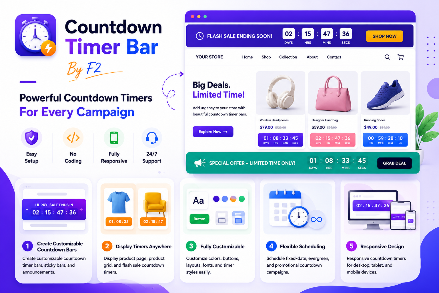
Countdown Timer Bar By F2
Countdown Timer Bar By F2 Installation Guide
Step 1: Install Countdown Timer Bar By F2
Install the app from the Shopify App Store and approve the required permissions.
Step 2: Open Theme Customizer
From your Shopify Admin, go to:
Online Store → Themes → CustomizeStep 3: Add a Countdown Timer Block
Click:
Add Section
or
Add Block
Search for:
Countdown Timer Bar By F2Then select your preferred timer design.
Step 4: Configure Timer Settings
Customize the timer directly from the Shopify Theme Editor:
- Heading text
- Countdown end date
- Button text
- Button link
- Background colors
- Text colors
- Button colors
- Font size
- Padding
- Border radius
- Timer styles
Step 5: Save Changes
Click:
SaveYour countdown timer will instantly appear on your storefront.
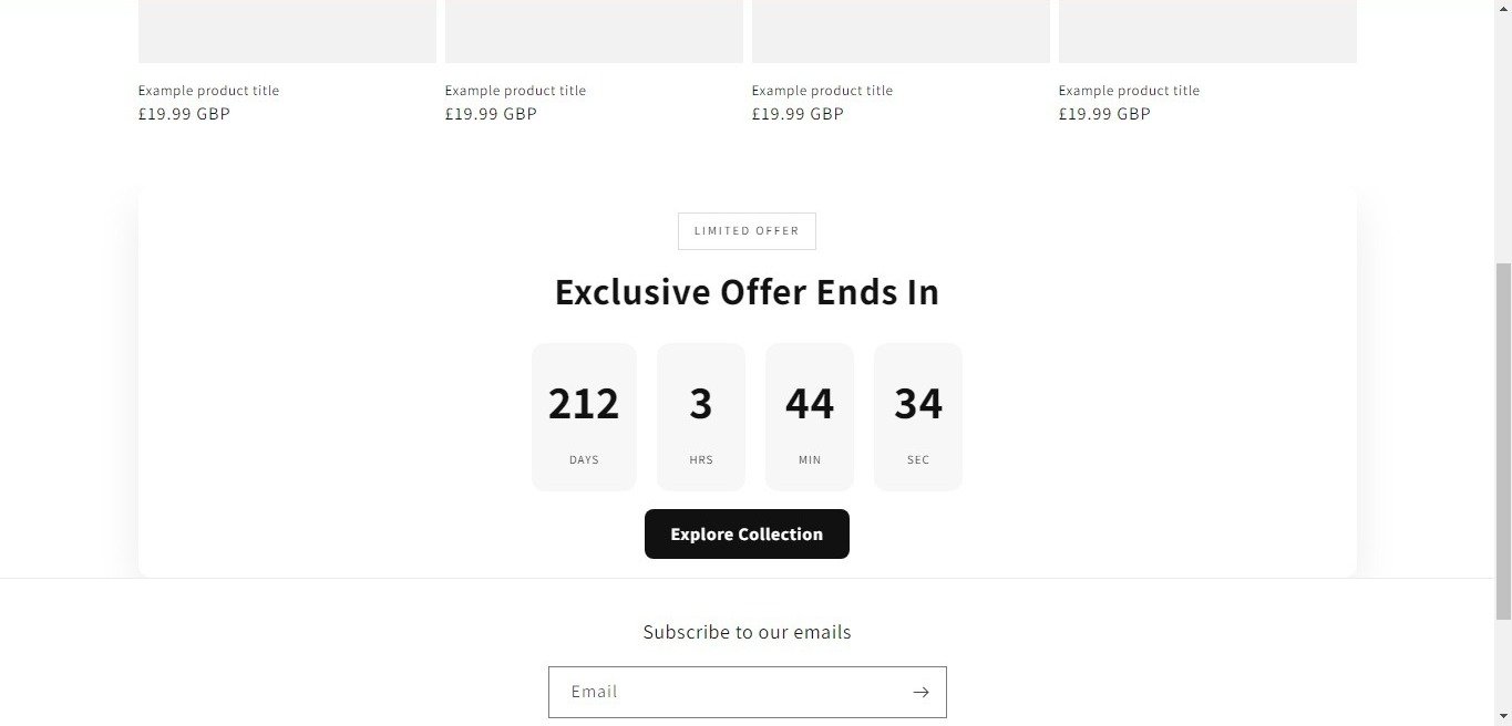
Setup Guide
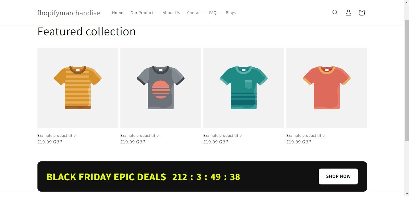
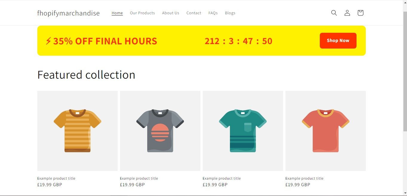
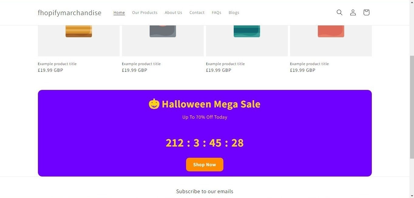
Announcement Timer Bar
Display promotional countdown bars across your store.
Available styles include:
- Black Friday Timer
- Flash Sale Timer
- Halloween Timer
- Luxury Timer
- Glass Timer
Perfect for:
- Limited-time offers
- Seasonal promotions
- Holiday campaigns
- Product launches
Product Page Timer
Display countdown timers directly on product pages.
Use product timers to highlight:
- Flash sales
- Special promotions
- Limited stock events
- Product launches
Product Grid Timer
Show countdown timers inside product cards and collection pages.
Product grid timers help customers easily identify time-sensitive offers while browsing products.
Sticky Announcement Bar
Display timers at the top or bottom of your store.
Features:
- Sticky display
- Responsive design
- Mobile-friendly layouts
- Promotional announcements
Flash Sale Campaigns
Create urgency-driven promotional campaigns using countdown timers.
Configure:
- Fixed date timers
- Evergreen timers
- Promotional banners
- Storewide announcements
Customization Options
Countdown Timer Bar By F2 provides extensive customization options:
Design Settings
- Background colors
- Text colors
- Button colors
- Border radius
- Layout styles
- Typography controls
Timer Settings
- End date selection
- Countdown display
- Timer labels
- Product-specific timers
Button Settings
- Button text
- Button colors
- Button links
- Button radius
Layout Settings
- Padding controls
- Mobile responsiveness
- Sticky positioning
- Multiple timer templates
Supported Locations
Countdown Timer Bar By F2 can be displayed on:
- Home page
- Product page
- Collection page
- Cart page
- Custom pages
- Announcement areas
- Product grids
Mobile Responsive
All countdown timer templates are fully responsive and optimized for:
- Desktop devices
- Tablets
- Mobile phones
Need Help?
If you need assistance with setup or customization, please contact our support team through the app support page.
If you need Support, please message us on WhatsApp. We will give you a response just in one minute. Or mail to us, Amzadhossen420360@gmail.com Or Contact Our Support Website : https://friends2a-technology.com/fhopify/contact-us/
Display countdown timer bars, product timers, and promotional announcements across your store.
Countdown Timer Bar By F2 helps merchants display countdown timers, announcement bars, sticky bars, and product timers throughout their Shopify store.
Create fixed-date, evergreen, flash sale, and promotional countdown campaigns using customizable templates. Merchants can adjust colors, fonts, buttons, layouts, timer styles, and positioning directly from the Shopify theme editor without editing code.
The app supports announcement timer bars, product page timers, product grid timers, flash sale
Create customizable countdown timer bars, sticky bars, and announcements.
Display product page, product grid, and flash sale countdown timers.
Customize colors, buttons, layouts, fonts, and timer styles easily.
Schedule fixed-date, evergreen, and promotional countdown campaigns.
Responsive countdown timers for desktop, tablet, and mobile devices.