Very Important Note: If you paste this code in all themes, you will find additional settings inside the apps section. Therefore, I recommend that no matter which theme you are using, you should paste this code in the Sections folder under the file name apps.liquid.
Hello, Our Apps Users
We’ve noticed that some users are experiencing issues with Shopify free apps when using the Horizon (new update) theme and a few other Shopify free themes.
However, this issue does not occur with the Shopify Dawn theme, Shopify core premium themes, or ThemeForest themes.
If you are facing this issue on the Horizon theme or any newly updated Shopify free theme, please review the Video we’ve shared and follow the guideline below.
Create file name : apps.liquid and past it
Summary :
– This issue is related to the Horizon / Shopify free theme layout behavior
– It is not an app bug
– Dawn, Shopify premium themes, and ThemeForest themes work without any issues
– Following the steps above will resolve the problem
If you still face issues after following this guide, please share updated screenshots and we will be happy to assist further.
Why This Issue Happens:
In the Horizon new update theme (and some other Shopify free themes), when you add an app block, it is automatically wrapped inside a Section container.
This Section applies automatic CSS and admin UI styles, which may conflict with the app’s layout. As a result, app content such as FlipBooks or iframe-based apps may appear squeezed, misaligned, or broken.
This is a theme-level layout behavior, not an app bug.
How to Fix the Issue (Solution)
Please follow these steps carefully:
1. Go to Online Store → Themes → Edit code
2. Open the Sections folder
3. Find the file named apps.liquid
– If the file exists, open it and paste the provided code into it
– If the file does not exist, create a new file named apps.liquid and paste the code into it
4. Save the file
5. Go back to Theme Customization
6. Add the app block again
After completing these steps, everything should display correctly.
					{%- style -%}
  .apps-section-{{ section.id }} {
    background-color: {{ section.settings.bg_color }};
    {% if section.settings.bg_image != blank %}
      background-image: url({{ section.settings.bg_image | image_url: width: 2400 }});
    {% else %}
      background-image: none;
    {% endif %}
    background-size: {{ section.settings.bg_size }};
    background-position: {{ section.settings.bg_position }};
    background-repeat: {{ section.settings.bg_repeat }};
    background-attachment: {{ section.settings.bg_attachment }};
    margin-top: {{ section.settings.margin_top }}px;
    margin-bottom: {{ section.settings.margin_bottom }}px;
    padding-top: {{ section.settings.padding_top }}px;
    padding-bottom: {{ section.settings.padding_bottom }}px;
    min-height: {{ section.settings.section_height }}px;
    position: relative;
    overflow: hidden;
  }

  .apps-section-{{ section.id }} .apps-section__inner {
    position: relative;
    z-index: 1;
    min-height: inherit;
    display: flex;
    flex-direction: column;
    justify-content: center;
  }

  .apps-section-{{ section.id }} .apps-section__blocks {
    display: flex;
    flex-direction: column;
    width: 100%;
    align-items:
      {% case section.settings.block_alignment %}
        {% when 'left' %} flex-start
        {% when 'center' %} center
        {% when 'right' %} flex-end
      {% endcase %};
  }

  .apps-section-{{ section.id }} .apps-section__block-item {
    width: 100%;
    max-width: 100%;
  }

  .apps-section-{{ section.id }} .apps-section__block-item > * {
    max-width: 100%;
  }

  @media screen and (max-width: 749px) {
    .apps-section-{{ section.id }} {
      margin-top: {{ section.settings.margin_top_mobile }}px;
      margin-bottom: {{ section.settings.margin_bottom_mobile }}px;
      padding-top: {{ section.settings.padding_top_mobile }}px;
      padding-bottom: {{ section.settings.padding_bottom_mobile }}px;
      min-height: {{ section.settings.section_height_mobile }}px;
      background-attachment: scroll;
    }
  }
{%- endstyle -%}

<div class="apps-section-{{ section.id }}">
  <div class="apps-section__inner {% if section.settings.include_margins %}page-width{% endif %}">
    <div class="apps-section__blocks">
      {% for block in section.blocks %}
        <div class="apps-section__block-item" {{ block.shopify_attributes }}>
          {% render block %}
        </div>
      {% endfor %}
    </div>
  </div>
</div>

{% schema %}
{
  "name": "Apps",
  "tag": "section",
  "class": "section",
  "settings": [
    {
      "type": "checkbox",
      "id": "include_margins",
      "default": true,
      "label": "Include page margins"
    },
    {
      "type": "header",
      "content": "Background"
    },
    {
      "type": "color",
      "id": "bg_color",
      "label": "Background color",
      "default": "#ffffff"
    },
    {
      "type": "image_picker",
      "id": "bg_image",
      "label": "Background image"
    },
    {
      "type": "select",
      "id": "bg_size",
      "label": "Background size",
      "default": "cover",
      "options": [
        { "value": "cover", "label": "Cover" },
        { "value": "contain", "label": "Contain" },
        { "value": "auto", "label": "Auto" }
      ]
    },
    {
      "type": "select",
      "id": "bg_position",
      "label": "Background position",
      "default": "center center",
      "options": [
        { "value": "left top", "label": "Left top" },
        { "value": "center top", "label": "Center top" },
        { "value": "right top", "label": "Right top" },
        { "value": "left center", "label": "Left center" },
        { "value": "center center", "label": "Center center" },
        { "value": "right center", "label": "Right center" },
        { "value": "left bottom", "label": "Left bottom" },
        { "value": "center bottom", "label": "Center bottom" },
        { "value": "right bottom", "label": "Right bottom" }
      ]
    },
    {
      "type": "select",
      "id": "bg_repeat",
      "label": "Background repeat",
      "default": "no-repeat",
      "options": [
        { "value": "no-repeat", "label": "No repeat" },
        { "value": "repeat", "label": "Repeat" },
        { "value": "repeat-x", "label": "Repeat horizontally" },
        { "value": "repeat-y", "label": "Repeat vertically" }
      ]
    },
    {
      "type": "select",
      "id": "bg_attachment",
      "label": "Background attachment",
      "default": "scroll",
      "options": [
        { "value": "scroll", "label": "Scroll" },
        { "value": "fixed", "label": "Fixed" }
      ]
    },
    {
      "type": "header",
      "content": "Desktop spacing"
    },
    {
      "type": "range",
      "id": "margin_top",
      "min": 0,
      "max": 300,
      "step": 4,
      "unit": "px",
      "label": "Margin top",
      "default": 0
    },
    {
      "type": "range",
      "id": "margin_bottom",
      "min": 0,
      "max": 300,
      "step": 4,
      "unit": "px",
      "label": "Margin bottom",
      "default": 0
    },
    {
      "type": "range",
      "id": "padding_top",
      "min": 0,
      "max": 300,
      "step": 4,
      "unit": "px",
      "label": "Padding top",
      "default": 0
    },
    {
      "type": "range",
      "id": "padding_bottom",
      "min": 0,
      "max": 300,
      "step": 4,
      "unit": "px",
      "label": "Padding bottom",
      "default": 0
    },
    {
      "type": "range",
      "id": "section_height",
      "min": 0,
      "max": 1200,
      "step": 20,
      "unit": "px",
      "label": "Section minimum height",
      "default": 0
    },
    {
      "type": "header",
      "content": "Mobile spacing"
    },
    {
      "type": "range",
      "id": "margin_top_mobile",
      "min": 0,
      "max": 200,
      "step": 4,
      "unit": "px",
      "label": "Mobile margin top",
      "default": 0
    },
    {
      "type": "range",
      "id": "margin_bottom_mobile",
      "min": 0,
      "max": 200,
      "step": 4,
      "unit": "px",
      "label": "Mobile margin bottom",
      "default": 0
    },
    {
      "type": "range",
      "id": "padding_top_mobile",
      "min": 0,
      "max": 200,
      "step": 4,
      "unit": "px",
      "label": "Mobile padding top",
      "default": 0
    },
    {
      "type": "range",
      "id": "padding_bottom_mobile",
      "min": 0,
      "max": 200,
      "step": 4,
      "unit": "px",
      "label": "Mobile padding bottom",
      "default": 0
    },
    {
      "type": "range",
      "id": "section_height_mobile",
      "min": 0,
      "max": 800,
      "step": 20,
      "unit": "px",
      "label": "Mobile section minimum height",
      "default": 0
    },
    {
      "type": "header",
      "content": "Block alignment"
    },
    {
      "type": "select",
      "id": "block_alignment",
      "label": "Block alignment",
      "default": "left",
      "options": [
        { "value": "left", "label": "Left" },
        { "value": "center", "label": "Center" },
        { "value": "right", "label": "Right" }
      ]
    }
  ],
  "blocks": [
    { "type": "@app" }
  ],
  "presets": [
    { "name": "Apps" }
  ]
}
{% endschema %}
Friends2a Photo & Product Albums Tutorial
Photo &Product Albums – Installation Guide
1. Create the apps.liquid File
Before adding the album blocks, first create an apps.liquid file in your Shopify theme.
Go to:
Online Store → Themes → … → Edit code
Under the Layout folder, create a new Liquid file named:
apps.liquid
Important: Make sure the file name is exactly
apps.liquid.
2. Add the Required App Code
Open the newly created apps.liquid file and add the code provided by Friends2a Photo & Product Albums.
Save the file after adding the code.
3. Open the Theme Customizer
Go back to:
Online Store → Themes → Customize
Open the theme editor for your storefront.
4. Open the Apps Section
Select the page or template where you want to display the album.
Open the Apps section and click Add Block.
You will see two blocks from the Friends2a Photo & Product Albums app:
- Image Album – Create interactive photo flipbook albums.
- Product Album – Create animated product catalog flipbooks.
You can add one or both blocks depending on your requirements.
5. Set Up the Image Album
Add the Image Album block to your desired section.
Configure:
- Cover Image
- End Cover Image
- Up to 16 Album Photos
- Album Width
- Album Height
- Mobile Height
- Flip Speed
- Spacing
- Colors
- Navigation Arrows
6. Set Up the Product Album
Add the Product Album block.
Then select a Product Collection.
Products from the selected collection will automatically be displayed as pages in the product flipbook.
You can configure:
- Product Price
- Product Description
- Add to Cart Button
- Navigation Controls
7. Position the Blocks
Place the Image Album or Product Album block in your preferred location.
You can also add both blocks to the same page.
8. Save the Theme
Click Save in the Shopify Theme Editor.
9. Preview the Album
Open your storefront and verify that the flipbook is displaying correctly.
Check the images, products, navigation buttons, and interactive flipbook functionality.
10. Check Desktop & Mobile
Preview the album on both desktop and mobile devices to make sure the layout is responsive and all features work correctly.
If you need Support, please message us on WhatsApp. We will give you a response just in one minute. Or mail to us, Amzadhossen420360@gmail.com Or Contact Our Support Website : https://whitesmoke-lemur-394720.hostingersite.com/contact-us/
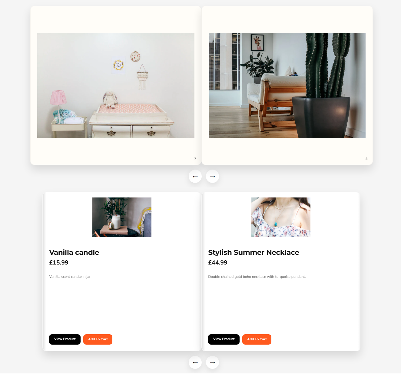
Friends2a Photo & Product Albums lets merchants create realistic 3D flipbook albums for images and product collections. Display products with images, prices, descriptions, and add to cart buttons in an interactive album layout. Merchants can customize cover images, navigation arrows, mobile height, spacing, and colors directly from the Shopify theme editor.
Feature 1
Create realistic 3D photo flipbook albums with smooth page animations
Feature 2
Show product collections in interactive catalog style album pages
Feature 3
Display product image, title, price, description, and add to cart
Feature 4
Customize cover images, arrows, spacing, colors, and mobile layout
Feature 5
Fully responsive album blocks optimized for desktop and mobile devices