Very Important Note: If you paste this code in all themes, you will find additional settings inside the apps section. Therefore, I recommend that no matter which theme you are using, you should paste this code in the Sections folder under the file name apps.liquid.
Hello, Our Apps Users
We’ve noticed that some users are experiencing issues with Shopify free apps when using the Horizon (new update) theme and a few other Shopify free themes.
However, this issue does not occur with the Shopify Dawn theme, Shopify core premium themes, or ThemeForest themes.
If you are facing this issue on the Horizon theme or any newly updated Shopify free theme, please review the Video we’ve shared and follow the guideline below.
Create file name : apps.liquid and past it
Summary :
– This issue is related to the Horizon / Shopify free theme layout behavior
– It is not an app bug
– Dawn, Shopify premium themes, and ThemeForest themes work without any issues
– Following the steps above will resolve the problem
If you still face issues after following this guide, please share updated screenshots and we will be happy to assist further.
Why This Issue Happens:
In the Horizon new update theme (and some other Shopify free themes), when you add an app block, it is automatically wrapped inside a Section container.
This Section applies automatic CSS and admin UI styles, which may conflict with the app’s layout. As a result, app content such as FlipBooks or iframe-based apps may appear squeezed, misaligned, or broken.
This is a theme-level layout behavior, not an app bug.
How to Fix the Issue (Solution)
Please follow these steps carefully:
1. Go to Online Store → Themes → Edit code
2. Open the Sections folder
3. Find the file named apps.liquid
– If the file exists, open it and paste the provided code into it
– If the file does not exist, create a new file named apps.liquid and paste the code into it
4. Save the file
5. Go back to Theme Customization
6. Add the app block again
After completing these steps, everything should display correctly.
					{%- style -%}
  .apps-section-{{ section.id }} {
    background-color: {{ section.settings.bg_color }};
    {% if section.settings.bg_image != blank %}
      background-image: url({{ section.settings.bg_image | image_url: width: 2400 }});
    {% else %}
      background-image: none;
    {% endif %}
    background-size: {{ section.settings.bg_size }};
    background-position: {{ section.settings.bg_position }};
    background-repeat: {{ section.settings.bg_repeat }};
    background-attachment: {{ section.settings.bg_attachment }};
    margin-top: {{ section.settings.margin_top }}px;
    margin-bottom: {{ section.settings.margin_bottom }}px;
    padding-top: {{ section.settings.padding_top }}px;
    padding-bottom: {{ section.settings.padding_bottom }}px;
    min-height: {{ section.settings.section_height }}px;
    position: relative;
    overflow: hidden;
  }

  .apps-section-{{ section.id }} .apps-section__inner {
    position: relative;
    z-index: 1;
    min-height: inherit;
    display: flex;
    flex-direction: column;
    justify-content: center;
  }

  .apps-section-{{ section.id }} .apps-section__blocks {
    display: flex;
    flex-direction: column;
    width: 100%;
    align-items:
      {% case section.settings.block_alignment %}
        {% when 'left' %} flex-start
        {% when 'center' %} center
        {% when 'right' %} flex-end
      {% endcase %};
  }

  .apps-section-{{ section.id }} .apps-section__block-item {
    width: 100%;
    max-width: 100%;
  }

  .apps-section-{{ section.id }} .apps-section__block-item > * {
    max-width: 100%;
  }

  @media screen and (max-width: 749px) {
    .apps-section-{{ section.id }} {
      margin-top: {{ section.settings.margin_top_mobile }}px;
      margin-bottom: {{ section.settings.margin_bottom_mobile }}px;
      padding-top: {{ section.settings.padding_top_mobile }}px;
      padding-bottom: {{ section.settings.padding_bottom_mobile }}px;
      min-height: {{ section.settings.section_height_mobile }}px;
      background-attachment: scroll;
    }
  }
{%- endstyle -%}

<div class="apps-section-{{ section.id }}">
  <div class="apps-section__inner {% if section.settings.include_margins %}page-width{% endif %}">
    <div class="apps-section__blocks">
      {% for block in section.blocks %}
        <div class="apps-section__block-item" {{ block.shopify_attributes }}>
          {% render block %}
        </div>
      {% endfor %}
    </div>
  </div>
</div>

{% schema %}
{
  "name": "Apps",
  "tag": "section",
  "class": "section",
  "settings": [
    {
      "type": "checkbox",
      "id": "include_margins",
      "default": true,
      "label": "Include page margins"
    },
    {
      "type": "header",
      "content": "Background"
    },
    {
      "type": "color",
      "id": "bg_color",
      "label": "Background color",
      "default": "#ffffff"
    },
    {
      "type": "image_picker",
      "id": "bg_image",
      "label": "Background image"
    },
    {
      "type": "select",
      "id": "bg_size",
      "label": "Background size",
      "default": "cover",
      "options": [
        { "value": "cover", "label": "Cover" },
        { "value": "contain", "label": "Contain" },
        { "value": "auto", "label": "Auto" }
      ]
    },
    {
      "type": "select",
      "id": "bg_position",
      "label": "Background position",
      "default": "center center",
      "options": [
        { "value": "left top", "label": "Left top" },
        { "value": "center top", "label": "Center top" },
        { "value": "right top", "label": "Right top" },
        { "value": "left center", "label": "Left center" },
        { "value": "center center", "label": "Center center" },
        { "value": "right center", "label": "Right center" },
        { "value": "left bottom", "label": "Left bottom" },
        { "value": "center bottom", "label": "Center bottom" },
        { "value": "right bottom", "label": "Right bottom" }
      ]
    },
    {
      "type": "select",
      "id": "bg_repeat",
      "label": "Background repeat",
      "default": "no-repeat",
      "options": [
        { "value": "no-repeat", "label": "No repeat" },
        { "value": "repeat", "label": "Repeat" },
        { "value": "repeat-x", "label": "Repeat horizontally" },
        { "value": "repeat-y", "label": "Repeat vertically" }
      ]
    },
    {
      "type": "select",
      "id": "bg_attachment",
      "label": "Background attachment",
      "default": "scroll",
      "options": [
        { "value": "scroll", "label": "Scroll" },
        { "value": "fixed", "label": "Fixed" }
      ]
    },
    {
      "type": "header",
      "content": "Desktop spacing"
    },
    {
      "type": "range",
      "id": "margin_top",
      "min": 0,
      "max": 300,
      "step": 4,
      "unit": "px",
      "label": "Margin top",
      "default": 0
    },
    {
      "type": "range",
      "id": "margin_bottom",
      "min": 0,
      "max": 300,
      "step": 4,
      "unit": "px",
      "label": "Margin bottom",
      "default": 0
    },
    {
      "type": "range",
      "id": "padding_top",
      "min": 0,
      "max": 300,
      "step": 4,
      "unit": "px",
      "label": "Padding top",
      "default": 0
    },
    {
      "type": "range",
      "id": "padding_bottom",
      "min": 0,
      "max": 300,
      "step": 4,
      "unit": "px",
      "label": "Padding bottom",
      "default": 0
    },
    {
      "type": "range",
      "id": "section_height",
      "min": 0,
      "max": 1200,
      "step": 20,
      "unit": "px",
      "label": "Section minimum height",
      "default": 0
    },
    {
      "type": "header",
      "content": "Mobile spacing"
    },
    {
      "type": "range",
      "id": "margin_top_mobile",
      "min": 0,
      "max": 200,
      "step": 4,
      "unit": "px",
      "label": "Mobile margin top",
      "default": 0
    },
    {
      "type": "range",
      "id": "margin_bottom_mobile",
      "min": 0,
      "max": 200,
      "step": 4,
      "unit": "px",
      "label": "Mobile margin bottom",
      "default": 0
    },
    {
      "type": "range",
      "id": "padding_top_mobile",
      "min": 0,
      "max": 200,
      "step": 4,
      "unit": "px",
      "label": "Mobile padding top",
      "default": 0
    },
    {
      "type": "range",
      "id": "padding_bottom_mobile",
      "min": 0,
      "max": 200,
      "step": 4,
      "unit": "px",
      "label": "Mobile padding bottom",
      "default": 0
    },
    {
      "type": "range",
      "id": "section_height_mobile",
      "min": 0,
      "max": 800,
      "step": 20,
      "unit": "px",
      "label": "Mobile section minimum height",
      "default": 0
    },
    {
      "type": "header",
      "content": "Block alignment"
    },
    {
      "type": "select",
      "id": "block_alignment",
      "label": "Block alignment",
      "default": "left",
      "options": [
        { "value": "left", "label": "Left" },
        { "value": "center", "label": "Center" },
        { "value": "right", "label": "Right" }
      ]
    }
  ],
  "blocks": [
    { "type": "@app" }
  ],
  "presets": [
    { "name": "Apps" }
  ]
}
{% endschema %}
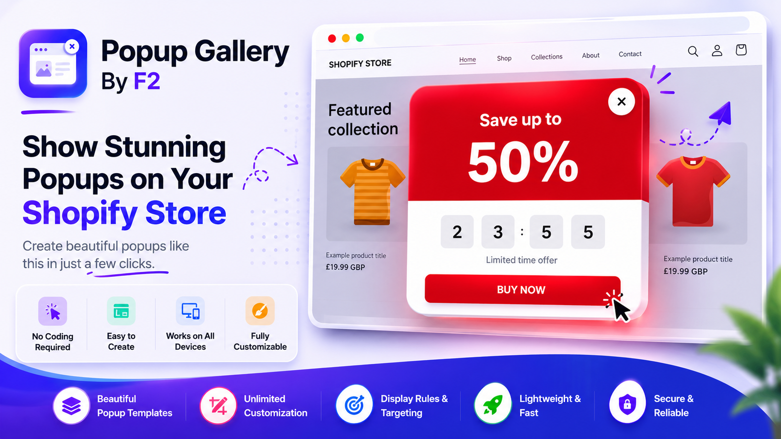
Popup Gallery By F2
Popup Gallery By F2 Installation Guide
Step 1: Install the App
Install Popup Gallery By F2 from the Shopify App Store.
Step 2: Open Theme Editor
Go to:
Online Store → Themes → Customize
Step 3: Add Popup Block
Click:
Add Block → Apps → Popup Gallery By F2
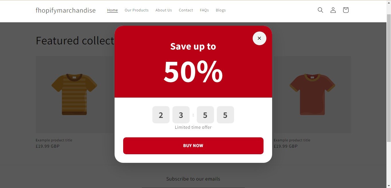
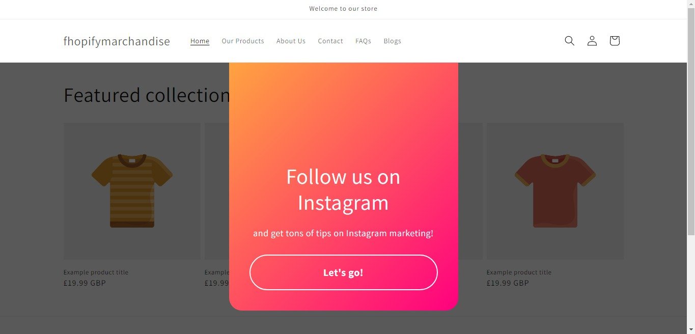
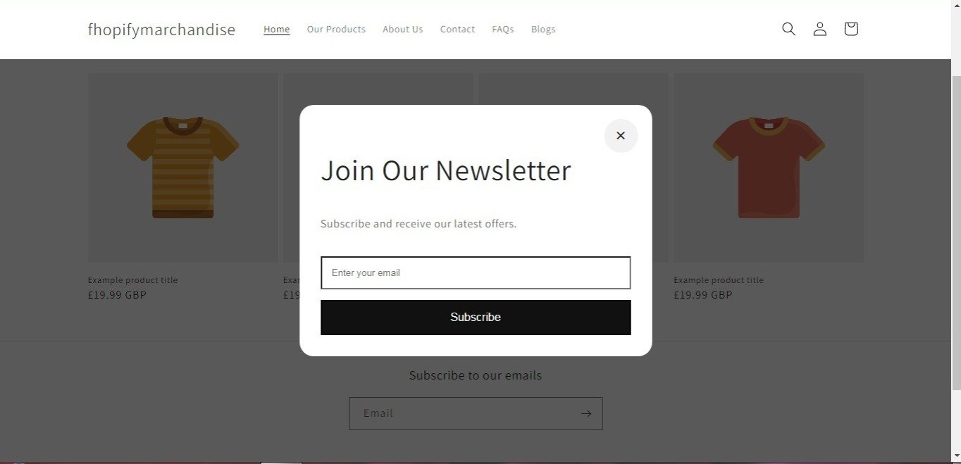
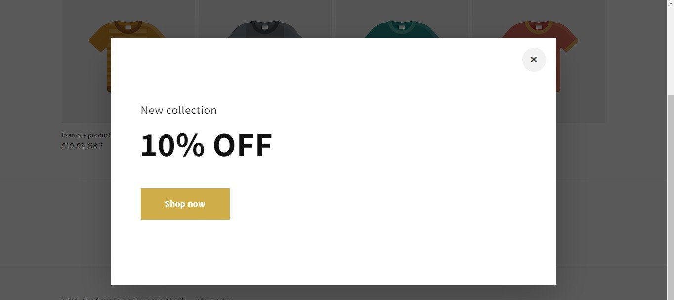
Select the popup type you want to display:
- Email Signup Popup
- Discount Popup
- Intro Popup
- Instagram Popup
- Split Offer Popup
- Countdown Timer Bar
Step 4: Customize the Popup
Configure popup settings such as:
- Heading
- Description
- Images
- Colors
- Button Text
- Button Links
- Width & Height
- Countdown Timer Settings
- Background Colors
- Typography
Step 5: Save Changes
Click Save in the Theme Editor.
Step 6: Preview Your Store
Open your storefront and refresh the page to see the popup in action.
Email Signup Popup
The Email Signup Popup uses Shopify’s native customer form system.
When a visitor submits their email:
- The email is added to the Shopify customer list.
- Customers can be tagged for newsletter subscriptions.
- No third-party email service is required.
Countdown Timer Bar
Add urgency to promotions by displaying:
- Flash Sale Timers
- Black Friday Countdowns
- Seasonal Campaign Timers
- Product Launch Countdowns
Customize:
- Colors
- Fonts
- Button Styles
- Timer End Date
- Desktop & Mobile Layout
Requirements
- Shopify Online Store 2.0 Theme
- Theme App Extensions Enabled
No coding required.
Support
If you need assistance with installation or configuration, contact the Popup Gallery By F2 support team.
Popup Gallery By F2 is designed to help merchants create beautiful popups, collect emails, display promotions, and customize store announcements directly from the Shopify Theme Editor.
If you need Support, please message us on WhatsApp. We will give you a response just in one minute. Or mail to us, Amzadhossen420360@gmail.com Or Contact Our Support Website : https://friends2a-technology.com/fhopify/contact-us/
Create customizable popups for email collection, promotions, announcements, and lead capture.
Popup Gallery By F2 helps merchants create and display customizable popups on their Shopify stores. Merchants can use email signup popups, discount popups, announcement popups, promotional popups, Instagram popups, and welcome popups to share information with visitors. The app includes customizable layouts, colors, text, images, and display settings, allowing merchants to match popups with their store design and communication needs.
Create customizable email signup, discount, and announcement popups.
Customize popup layouts, colors, text, images, and button styles.
Display promotional, welcome, and social media popups on your store.
Responsive popup designs optimized for desktop and mobile devices.
Collect customer emails using built-in newsletter signup popups.