
apps.liquid.Summary :
– This issue is related to the Horizon / Shopify free theme layout behavior
– It is not an app bug
– Dawn, Shopify premium themes, and ThemeForest themes work without any issues
– Following the steps above will resolve the problem
If you still face issues after following this guide, please share updated screenshots and we will be happy to assist further.
In the Horizon new update theme (and some other Shopify free themes), when you add an app block, it is automatically wrapped inside a Section container.
This Section applies automatic CSS and admin UI styles, which may conflict with the app’s layout. As a result, app content such as FlipBooks or iframe-based apps may appear squeezed, misaligned, or broken.
This is a theme-level layout behavior, not an app bug.
How to Fix the Issue (Solution)
Please follow these steps carefully:
1. Go to Online Store → Themes → Edit code
2. Open the Sections folder
3. Find the file named apps.liquid
– If the file exists, open it and paste the provided code into it
– If the file does not exist, create a new file named apps.liquid and paste the code into it
4. Save the file
5. Go back to Theme Customization
6. Add the app block again
After completing these steps, everything should display correctly.
					{%- style -%}
  .apps-section-{{ section.id }} {
    background-color: {{ section.settings.bg_color }};
    {% if section.settings.bg_image != blank %}
      background-image: url({{ section.settings.bg_image | image_url: width: 2400 }});
    {% else %}
      background-image: none;
    {% endif %}
    background-size: {{ section.settings.bg_size }};
    background-position: {{ section.settings.bg_position }};
    background-repeat: {{ section.settings.bg_repeat }};
    background-attachment: {{ section.settings.bg_attachment }};
    margin-top: {{ section.settings.margin_top }}px;
    margin-bottom: {{ section.settings.margin_bottom }}px;
    padding-top: {{ section.settings.padding_top }}px;
    padding-bottom: {{ section.settings.padding_bottom }}px;
    min-height: {{ section.settings.section_height }}px;
    position: relative;
    overflow: hidden;
  }

  .apps-section-{{ section.id }} .apps-section__inner {
    position: relative;
    z-index: 1;
    min-height: inherit;
    display: flex;
    flex-direction: column;
    justify-content: center;
  }

  .apps-section-{{ section.id }} .apps-section__blocks {
    display: flex;
    flex-direction: column;
    width: 100%;
    align-items:
      {% case section.settings.block_alignment %}
        {% when 'left' %} flex-start
        {% when 'center' %} center
        {% when 'right' %} flex-end
      {% endcase %};
  }

  .apps-section-{{ section.id }} .apps-section__block-item {
    width: 100%;
    max-width: 100%;
  }

  .apps-section-{{ section.id }} .apps-section__block-item > * {
    max-width: 100%;
  }

  @media screen and (max-width: 749px) {
    .apps-section-{{ section.id }} {
      margin-top: {{ section.settings.margin_top_mobile }}px;
      margin-bottom: {{ section.settings.margin_bottom_mobile }}px;
      padding-top: {{ section.settings.padding_top_mobile }}px;
      padding-bottom: {{ section.settings.padding_bottom_mobile }}px;
      min-height: {{ section.settings.section_height_mobile }}px;
      background-attachment: scroll;
    }
  }
{%- endstyle -%}

<div class="apps-section-{{ section.id }}">
  <div class="apps-section__inner {% if section.settings.include_margins %}page-width{% endif %}">
    <div class="apps-section__blocks">
      {% for block in section.blocks %}
        <div class="apps-section__block-item" {{ block.shopify_attributes }}>
          {% render block %}
        </div>
      {% endfor %}
    </div>
  </div>
</div>

{% schema %}
{
  "name": "Apps",
  "tag": "section",
  "class": "section",
  "settings": [
    {
      "type": "checkbox",
      "id": "include_margins",
      "default": true,
      "label": "Include page margins"
    },
    {
      "type": "header",
      "content": "Background"
    },
    {
      "type": "color",
      "id": "bg_color",
      "label": "Background color",
      "default": "#ffffff"
    },
    {
      "type": "image_picker",
      "id": "bg_image",
      "label": "Background image"
    },
    {
      "type": "select",
      "id": "bg_size",
      "label": "Background size",
      "default": "cover",
      "options": [
        { "value": "cover", "label": "Cover" },
        { "value": "contain", "label": "Contain" },
        { "value": "auto", "label": "Auto" }
      ]
    },
    {
      "type": "select",
      "id": "bg_position",
      "label": "Background position",
      "default": "center center",
      "options": [
        { "value": "left top", "label": "Left top" },
        { "value": "center top", "label": "Center top" },
        { "value": "right top", "label": "Right top" },
        { "value": "left center", "label": "Left center" },
        { "value": "center center", "label": "Center center" },
        { "value": "right center", "label": "Right center" },
        { "value": "left bottom", "label": "Left bottom" },
        { "value": "center bottom", "label": "Center bottom" },
        { "value": "right bottom", "label": "Right bottom" }
      ]
    },
    {
      "type": "select",
      "id": "bg_repeat",
      "label": "Background repeat",
      "default": "no-repeat",
      "options": [
        { "value": "no-repeat", "label": "No repeat" },
        { "value": "repeat", "label": "Repeat" },
        { "value": "repeat-x", "label": "Repeat horizontally" },
        { "value": "repeat-y", "label": "Repeat vertically" }
      ]
    },
    {
      "type": "select",
      "id": "bg_attachment",
      "label": "Background attachment",
      "default": "scroll",
      "options": [
        { "value": "scroll", "label": "Scroll" },
        { "value": "fixed", "label": "Fixed" }
      ]
    },
    {
      "type": "header",
      "content": "Desktop spacing"
    },
    {
      "type": "range",
      "id": "margin_top",
      "min": 0,
      "max": 300,
      "step": 4,
      "unit": "px",
      "label": "Margin top",
      "default": 0
    },
    {
      "type": "range",
      "id": "margin_bottom",
      "min": 0,
      "max": 300,
      "step": 4,
      "unit": "px",
      "label": "Margin bottom",
      "default": 0
    },
    {
      "type": "range",
      "id": "padding_top",
      "min": 0,
      "max": 300,
      "step": 4,
      "unit": "px",
      "label": "Padding top",
      "default": 0
    },
    {
      "type": "range",
      "id": "padding_bottom",
      "min": 0,
      "max": 300,
      "step": 4,
      "unit": "px",
      "label": "Padding bottom",
      "default": 0
    },
    {
      "type": "range",
      "id": "section_height",
      "min": 0,
      "max": 1200,
      "step": 20,
      "unit": "px",
      "label": "Section minimum height",
      "default": 0
    },
    {
      "type": "header",
      "content": "Mobile spacing"
    },
    {
      "type": "range",
      "id": "margin_top_mobile",
      "min": 0,
      "max": 200,
      "step": 4,
      "unit": "px",
      "label": "Mobile margin top",
      "default": 0
    },
    {
      "type": "range",
      "id": "margin_bottom_mobile",
      "min": 0,
      "max": 200,
      "step": 4,
      "unit": "px",
      "label": "Mobile margin bottom",
      "default": 0
    },
    {
      "type": "range",
      "id": "padding_top_mobile",
      "min": 0,
      "max": 200,
      "step": 4,
      "unit": "px",
      "label": "Mobile padding top",
      "default": 0
    },
    {
      "type": "range",
      "id": "padding_bottom_mobile",
      "min": 0,
      "max": 200,
      "step": 4,
      "unit": "px",
      "label": "Mobile padding bottom",
      "default": 0
    },
    {
      "type": "range",
      "id": "section_height_mobile",
      "min": 0,
      "max": 800,
      "step": 20,
      "unit": "px",
      "label": "Mobile section minimum height",
      "default": 0
    },
    {
      "type": "header",
      "content": "Block alignment"
    },
    {
      "type": "select",
      "id": "block_alignment",
      "label": "Block alignment",
      "default": "left",
      "options": [
        { "value": "left", "label": "Left" },
        { "value": "center", "label": "Center" },
        { "value": "right", "label": "Right" }
      ]
    }
  ],
  "blocks": [
    { "type": "@app" }
  ],
  "presets": [
    { "name": "Apps" }
  ]
}
{% endschema %}
If you need Support, please message us on WhatsApp. We will give you a response just in one minute. Or mail to us, Amzadhossen420360@gmail.com Or Contact Our Support Website : https://whitesmoke-lemur-394720.hostingersite.com/contact-us/
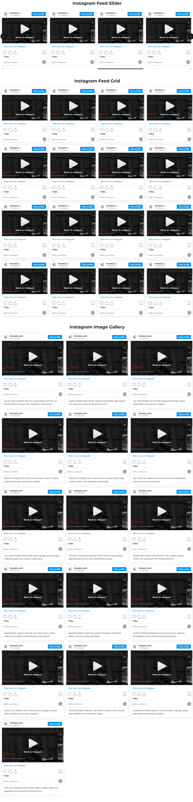
F2 Instagram Feed helps merchants showcase Instagram posts, reels and video content in beautiful responsive layouts. Easily display Instagram feeds in grid, slider or gallery sections without editing theme code. Customize desktop, tablet and mobile columns directly from the Shopify theme editor. The app is lightweight, mobile-friendly and designed to improve store engagement, social proof and visual shopping experiences.Display Instagram feeds in responsive grid, slider and gallery layouts
Show Instagram reels, videos and image posts beautifully on your store
Customize desktop, tablet and mobile feed columns easily
Fast-loading Instagram feed blocks with responsive mobile support
Add up to 16 Instagram posts with modern customizable layouts
Installation Guide
1. Install the F2 Instagram Feed app from the Shopify App Store.
2. Open your Shopify Theme Customizer:
Online Store → Themes → Customize
3. Click “Add section” or “Add block”.
4. Search for:
– F2 Instagram Grid
– F2 Instagram Slider
– F2 Instagram Gallery
5. Add your preferred Instagram feed block to the page.
6. Paste your Instagram post, reel or video links into the block settings.
7. Customize:
– Desktop columns
– Tablet columns
– Mobile columns
– Slider autoplay
– Feed layouts
8. Save your theme settings.
Your Instagram feed will now display automatically on your storefront in responsive grid, slider or gallery layouts.