
apps.liquid.Summary :
– This issue is related to the Horizon / Shopify free theme layout behavior
– It is not an app bug
– Dawn, Shopify premium themes, and ThemeForest themes work without any issues
– Following the steps above will resolve the problem
If you still face issues after following this guide, please share updated screenshots and we will be happy to assist further.
In the Horizon new update theme (and some other Shopify free themes), when you add an app block, it is automatically wrapped inside a Section container.
This Section applies automatic CSS and admin UI styles, which may conflict with the app’s layout. As a result, app content such as FlipBooks or iframe-based apps may appear squeezed, misaligned, or broken.
This is a theme-level layout behavior, not an app bug.
How to Fix the Issue (Solution)
Please follow these steps carefully:
1. Go to Online Store → Themes → Edit code
2. Open the Sections folder
3. Find the file named apps.liquid
– If the file exists, open it and paste the provided code into it
– If the file does not exist, create a new file named apps.liquid and paste the code into it
4. Save the file
5. Go back to Theme Customization
6. Add the app block again
After completing these steps, everything should display correctly.
					{%- style -%}
  .apps-section-{{ section.id }} {
    background-color: {{ section.settings.bg_color }};
    {% if section.settings.bg_image != blank %}
      background-image: url({{ section.settings.bg_image | image_url: width: 2400 }});
    {% else %}
      background-image: none;
    {% endif %}
    background-size: {{ section.settings.bg_size }};
    background-position: {{ section.settings.bg_position }};
    background-repeat: {{ section.settings.bg_repeat }};
    background-attachment: {{ section.settings.bg_attachment }};
    margin-top: {{ section.settings.margin_top }}px;
    margin-bottom: {{ section.settings.margin_bottom }}px;
    padding-top: {{ section.settings.padding_top }}px;
    padding-bottom: {{ section.settings.padding_bottom }}px;
    min-height: {{ section.settings.section_height }}px;
    position: relative;
    overflow: hidden;
  }

  .apps-section-{{ section.id }} .apps-section__inner {
    position: relative;
    z-index: 1;
    min-height: inherit;
    display: flex;
    flex-direction: column;
    justify-content: center;
  }

  .apps-section-{{ section.id }} .apps-section__blocks {
    display: flex;
    flex-direction: column;
    width: 100%;
    align-items:
      {% case section.settings.block_alignment %}
        {% when 'left' %} flex-start
        {% when 'center' %} center
        {% when 'right' %} flex-end
      {% endcase %};
  }

  .apps-section-{{ section.id }} .apps-section__block-item {
    width: 100%;
    max-width: 100%;
  }

  .apps-section-{{ section.id }} .apps-section__block-item > * {
    max-width: 100%;
  }

  @media screen and (max-width: 749px) {
    .apps-section-{{ section.id }} {
      margin-top: {{ section.settings.margin_top_mobile }}px;
      margin-bottom: {{ section.settings.margin_bottom_mobile }}px;
      padding-top: {{ section.settings.padding_top_mobile }}px;
      padding-bottom: {{ section.settings.padding_bottom_mobile }}px;
      min-height: {{ section.settings.section_height_mobile }}px;
      background-attachment: scroll;
    }
  }
{%- endstyle -%}

<div class="apps-section-{{ section.id }}">
  <div class="apps-section__inner {% if section.settings.include_margins %}page-width{% endif %}">
    <div class="apps-section__blocks">
      {% for block in section.blocks %}
        <div class="apps-section__block-item" {{ block.shopify_attributes }}>
          {% render block %}
        </div>
      {% endfor %}
    </div>
  </div>
</div>

{% schema %}
{
  "name": "Apps",
  "tag": "section",
  "class": "section",
  "settings": [
    {
      "type": "checkbox",
      "id": "include_margins",
      "default": true,
      "label": "Include page margins"
    },
    {
      "type": "header",
      "content": "Background"
    },
    {
      "type": "color",
      "id": "bg_color",
      "label": "Background color",
      "default": "#ffffff"
    },
    {
      "type": "image_picker",
      "id": "bg_image",
      "label": "Background image"
    },
    {
      "type": "select",
      "id": "bg_size",
      "label": "Background size",
      "default": "cover",
      "options": [
        { "value": "cover", "label": "Cover" },
        { "value": "contain", "label": "Contain" },
        { "value": "auto", "label": "Auto" }
      ]
    },
    {
      "type": "select",
      "id": "bg_position",
      "label": "Background position",
      "default": "center center",
      "options": [
        { "value": "left top", "label": "Left top" },
        { "value": "center top", "label": "Center top" },
        { "value": "right top", "label": "Right top" },
        { "value": "left center", "label": "Left center" },
        { "value": "center center", "label": "Center center" },
        { "value": "right center", "label": "Right center" },
        { "value": "left bottom", "label": "Left bottom" },
        { "value": "center bottom", "label": "Center bottom" },
        { "value": "right bottom", "label": "Right bottom" }
      ]
    },
    {
      "type": "select",
      "id": "bg_repeat",
      "label": "Background repeat",
      "default": "no-repeat",
      "options": [
        { "value": "no-repeat", "label": "No repeat" },
        { "value": "repeat", "label": "Repeat" },
        { "value": "repeat-x", "label": "Repeat horizontally" },
        { "value": "repeat-y", "label": "Repeat vertically" }
      ]
    },
    {
      "type": "select",
      "id": "bg_attachment",
      "label": "Background attachment",
      "default": "scroll",
      "options": [
        { "value": "scroll", "label": "Scroll" },
        { "value": "fixed", "label": "Fixed" }
      ]
    },
    {
      "type": "header",
      "content": "Desktop spacing"
    },
    {
      "type": "range",
      "id": "margin_top",
      "min": 0,
      "max": 300,
      "step": 4,
      "unit": "px",
      "label": "Margin top",
      "default": 0
    },
    {
      "type": "range",
      "id": "margin_bottom",
      "min": 0,
      "max": 300,
      "step": 4,
      "unit": "px",
      "label": "Margin bottom",
      "default": 0
    },
    {
      "type": "range",
      "id": "padding_top",
      "min": 0,
      "max": 300,
      "step": 4,
      "unit": "px",
      "label": "Padding top",
      "default": 0
    },
    {
      "type": "range",
      "id": "padding_bottom",
      "min": 0,
      "max": 300,
      "step": 4,
      "unit": "px",
      "label": "Padding bottom",
      "default": 0
    },
    {
      "type": "range",
      "id": "section_height",
      "min": 0,
      "max": 1200,
      "step": 20,
      "unit": "px",
      "label": "Section minimum height",
      "default": 0
    },
    {
      "type": "header",
      "content": "Mobile spacing"
    },
    {
      "type": "range",
      "id": "margin_top_mobile",
      "min": 0,
      "max": 200,
      "step": 4,
      "unit": "px",
      "label": "Mobile margin top",
      "default": 0
    },
    {
      "type": "range",
      "id": "margin_bottom_mobile",
      "min": 0,
      "max": 200,
      "step": 4,
      "unit": "px",
      "label": "Mobile margin bottom",
      "default": 0
    },
    {
      "type": "range",
      "id": "padding_top_mobile",
      "min": 0,
      "max": 200,
      "step": 4,
      "unit": "px",
      "label": "Mobile padding top",
      "default": 0
    },
    {
      "type": "range",
      "id": "padding_bottom_mobile",
      "min": 0,
      "max": 200,
      "step": 4,
      "unit": "px",
      "label": "Mobile padding bottom",
      "default": 0
    },
    {
      "type": "range",
      "id": "section_height_mobile",
      "min": 0,
      "max": 800,
      "step": 20,
      "unit": "px",
      "label": "Mobile section minimum height",
      "default": 0
    },
    {
      "type": "header",
      "content": "Block alignment"
    },
    {
      "type": "select",
      "id": "block_alignment",
      "label": "Block alignment",
      "default": "left",
      "options": [
        { "value": "left", "label": "Left" },
        { "value": "center", "label": "Center" },
        { "value": "right", "label": "Right" }
      ]
    }
  ],
  "blocks": [
    { "type": "@app" }
  ],
  "presets": [
    { "name": "Apps" }
  ]
}
{% endschema %}
If you need Support, please message us on WhatsApp. We will give you a response just in one minute. Or mail to us, Amzadhossen420360@gmail.com Or Contact Our Support Website : https://friends2a-technology.com/fhopify/contact-us/
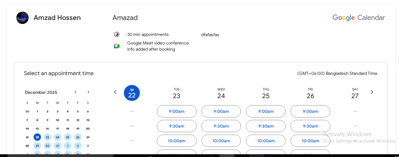
Friends2a Google Calendar lets you embed your Google Calendar directly into your Shopify store. This document explains how to set up and configure the calendar for a clean, responsive display.
Prerequisites
– A published Google Calendar or Appointment Schedule
– A Shopify store with an Online Store 2.0 compatible theme
Get Google Calendar Embed URL
1. Open Google Calendar
2. Go to Settings
3. Select Settings for my calendars
4. Choose the calendar you want to embed
5. Scroll to Integrate calendar
6. Copy the Embed URL from the iframe src (not the full iframe code)
Example:
https://calendar.google.com/calendar/embed?src=XXXXXXXX
Add App Block to Page
1. Go to Shopify Admin
2. Navigate to Online Store → Customize
3. Select a page (Home, Contact, Booking, or custom page)
4. Click Add section/block
5. Choose Friends2a Google Calendar
6. Position the block on the page
7. Click Save
Configure Calendar Settings
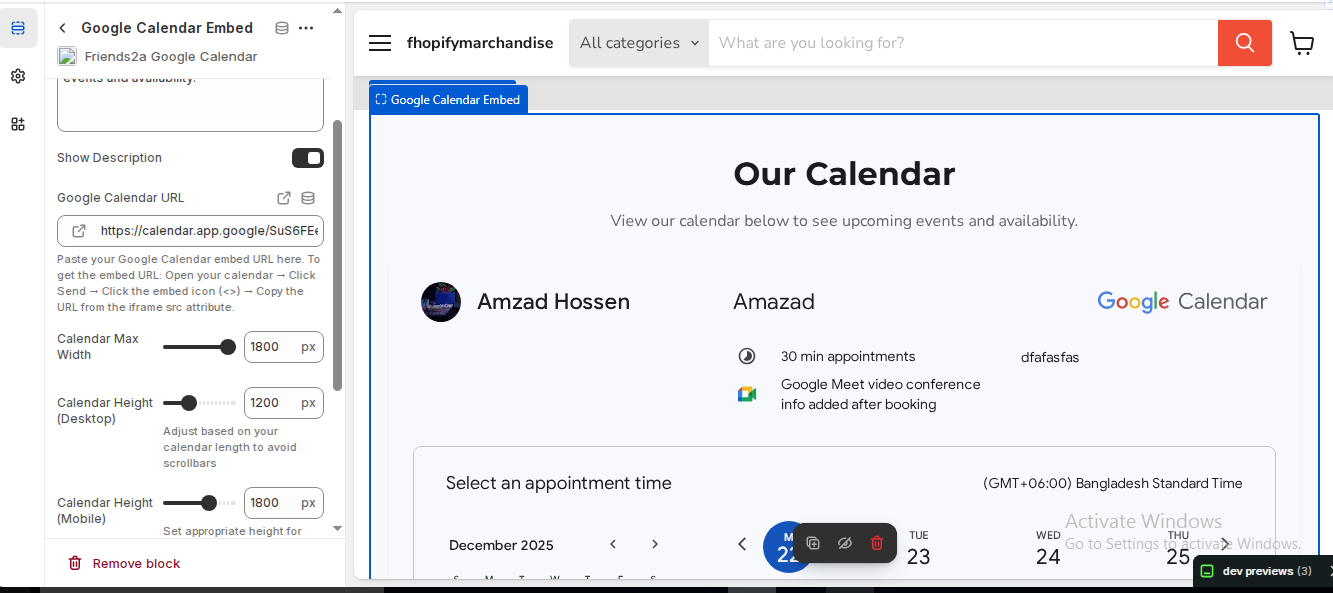
⦁ Google Calendar URL: Paste the iframe src embed URL
⦁ Calendar Max Width: 1000–1400 px
⦁ Calendar Height (Desktop): 1100–1300 px
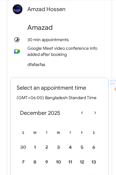
⦁ Calendar Height (Mobile): 1500–1800 px
⦁ Background Color: Optional
⦁ Border Radius & Padding: Optional
Verify & Adjust
1. Preview the page on desktop and mobile
2. Increase height if inner scrollbars appear
3. Adjust max width if layout feels narrow or wide
4. Test date navigation and appointment visibility
Completion
Your Google Calendar is now embedded inline on your Shopify store. Customers can view availability and schedules without leaving your site.